10 Gradient Color Palettes That Will Make Your SaaS Landing Page Look Premium
Flat backgrounds are out. The world's best SaaS brands — Stripe, Linear, Airbnb — use CSS gradients to build depth, guide attention, and signal a premium product before the user reads a single word. Here are 10 hand-picked, production-ready gradient palettes to elevate your next landing page.
1. The "Midnight Pro" — Deep Tech
The go-to palette for dark-mode dashboards and developer tools. The near-black transition from slate to a slightly lighter navy gives white text and neon accents a clean, high-contrast stage to perform on.
Vibe: Sophisticated, Secure, Modern.
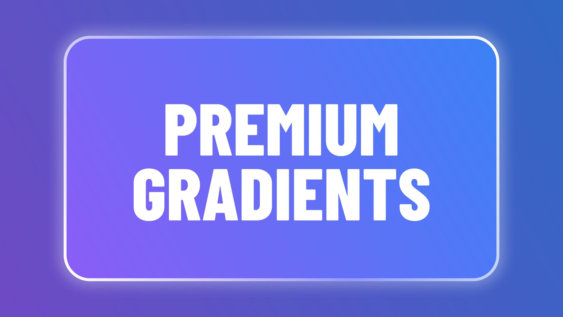
2. The "Electric Violet" — Web3 & AI
Purple-to-blue is the lingua franca of cutting-edge tech. This transition radiates energy without tipping into garish territory — perfect for AI platforms, Web3 products, or anything that needs to feel five minutes into the future.
Vibe: Innovative, Energetic, Future-proof.
3. "Soft Sunset" — Lifestyle & Wellness
Warm, peachy tones that feel immediately approachable. Consumer apps in health, fitness, or self-improvement will find this palette instantly communicates calm friendliness without any of the clinical coldness that trips up so many wellness brands.
Vibe: Warm, Friendly, Inviting.
4. "The Arctic Mint" — Fintech & Clean Tech
Clean, crisp, and transparent-feeling. Mint-to-cyan carries instant connotations of clarity and trust — exactly what banking, insurance, or sustainability startups need to establish credibility in the first three seconds.
Vibe: Fresh, Reliable, Efficient.
5. "Cyberpunk Neon" — Gaming & Creative
High-saturation pink to sky blue. Deploy this on CTA buttons, hero text, or animated borders — not entire backgrounds. Used with restraint it turns key UI elements into unmissable focal points; used everywhere it becomes visual noise.
Vibe: Bold, Artistic, Exciting.
6. "The Obsidian Gold" — Luxury & Enterprise
A micro-contrast dark gradient with a barely-there warm bronze undertone. The shift is subtle enough that most visitors won't consciously notice it — they'll just feel like the page is expensive. Ideal for high-ticket SaaS or enterprise sales pages.
Vibe: Exclusive, Rich, Serious.
7. "Hyper-Growth Blue" — Corporate SaaS
Classic B2B blue, modernized. The deep anchor at #2563EB lightens into an airy powder at #7DD3FC, giving the gradient a sense of upward momentum that pairs perfectly with growth-stage product messaging. Familiar enough to build trust; fresh enough to not look like a 2015 startup template.
Vibe: Professional, Scalable, Logical.
8. "Rose Quartz" — E-commerce & Fashion
Muted lilac easing into near-white cream. The delicacy of this transition makes product photography pop without competing with it — exactly what fashion, beauty, and lifestyle e-commerce brands need for hero sections and editorial layouts.
Vibe: Elegant, Soft, Minimalist.
9. "Forest Deep" — Environmental & Bio-Tech
Deep emerald shading into an almost-black forest. This moves far beyond the clichéd neon greens of environmental branding and into something that feels genuinely organic and serious — ideal for bio-tech, AgriTech, or any sustainability brand aiming for a premium audience.
Vibe: Organic, Grounded, Technical.
10. "The Glass Base" — Neutral UI
A barely-there blueish-grey sweep designed as the perfect canvas for Glassmorphic card elements. The subtle tonal shift keeps the background visually alive without upstaging your UI. Pair it with frosted glass panels for maximum effect.
Vibe: Clean, Structural, Unobtrusive.
Why Gradients Matter for SEO
Search engines don't see colors — but they do measure how users behave on your page. A visually polished design keeps visitors browsing longer, which raises dwell time. And a premium first impression reduces the chance that someone bounces back to the search results the moment they land. Both signals tell Google your page is worth ranking.
Customize Any of These in the Gradient Generator
No two brands are identical — every project needs a slightly different angle, stop position, or hue shift to feel truly ownable. Pick your favourite duo above, open the DesignCoder Gradient Generator, paste the hex codes in, and toggle between Linear and Radial until it clicks.
Want more inspiration? Browse all Color Palettes or read more Design Tips.