The Glassmorphism Survival Guide: How To Use It Without Ruining UX
Glassmorphism's frosted-glass aesthetic is one of the most striking UI trends of the decade—but it's also one of the easiest to get wrong. Unreadable text, performance issues, and accessibility failures lurk behind every blurry card. This guide walks you through the right way to master the glass look while keeping your interface professional, legible, and inclusive.
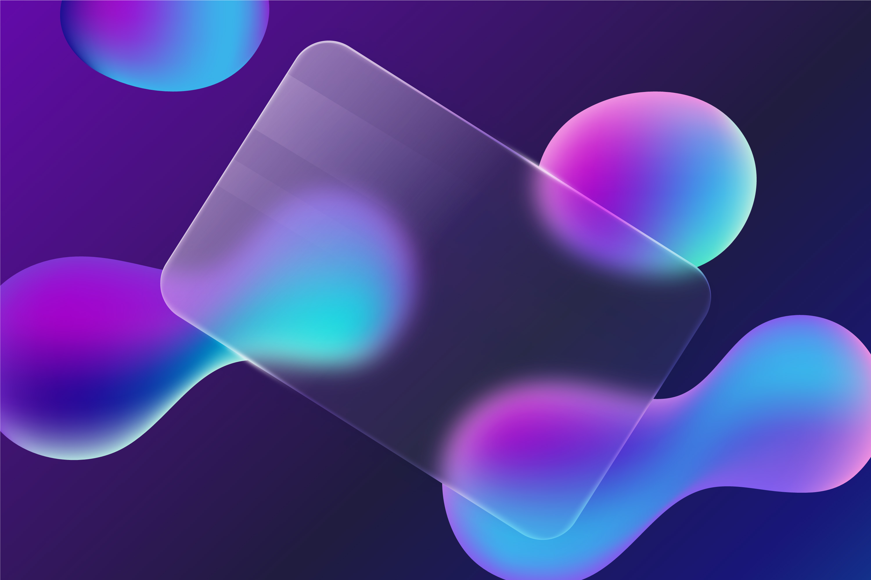
1. The Four Core Ingredients of Glassmorphism
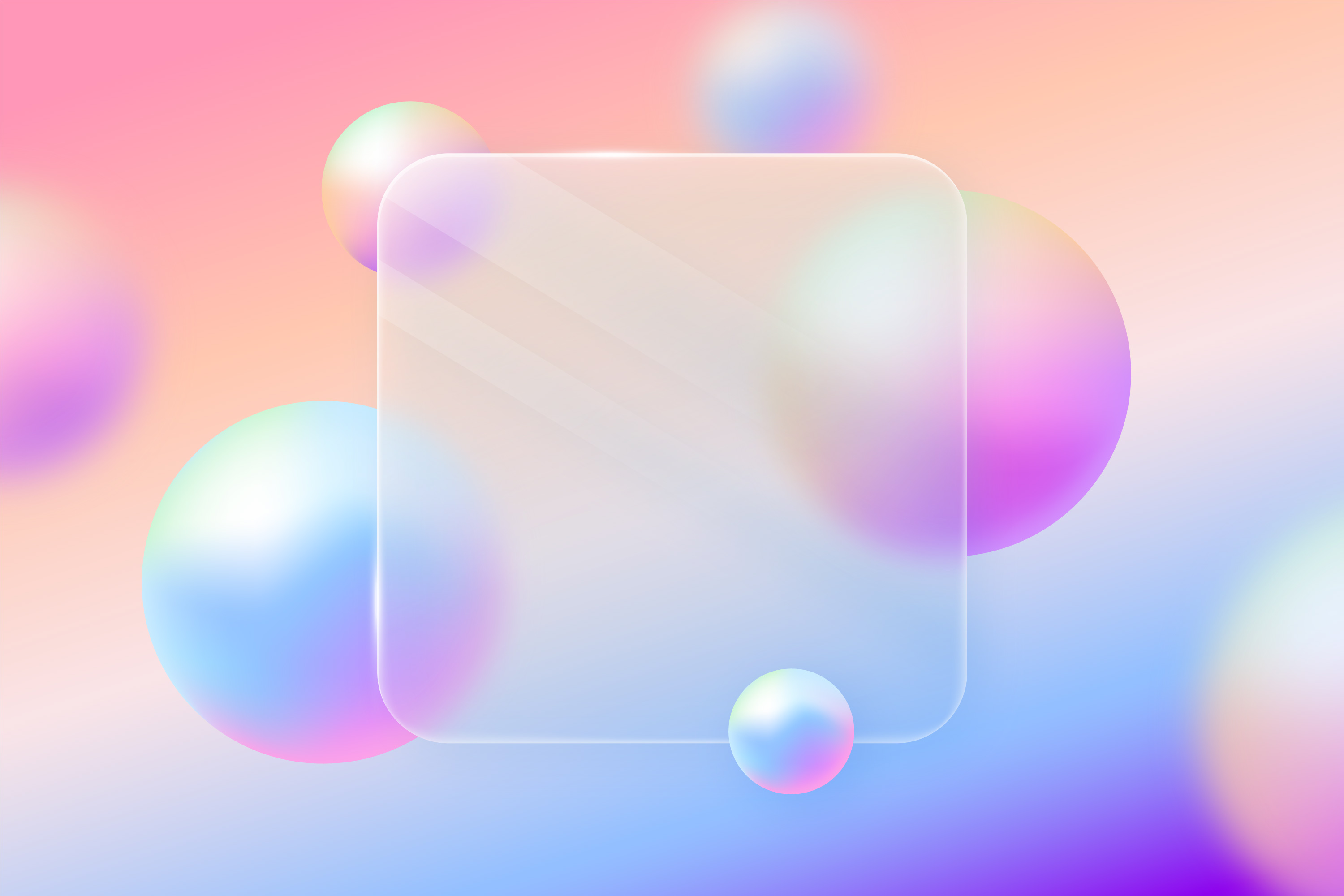
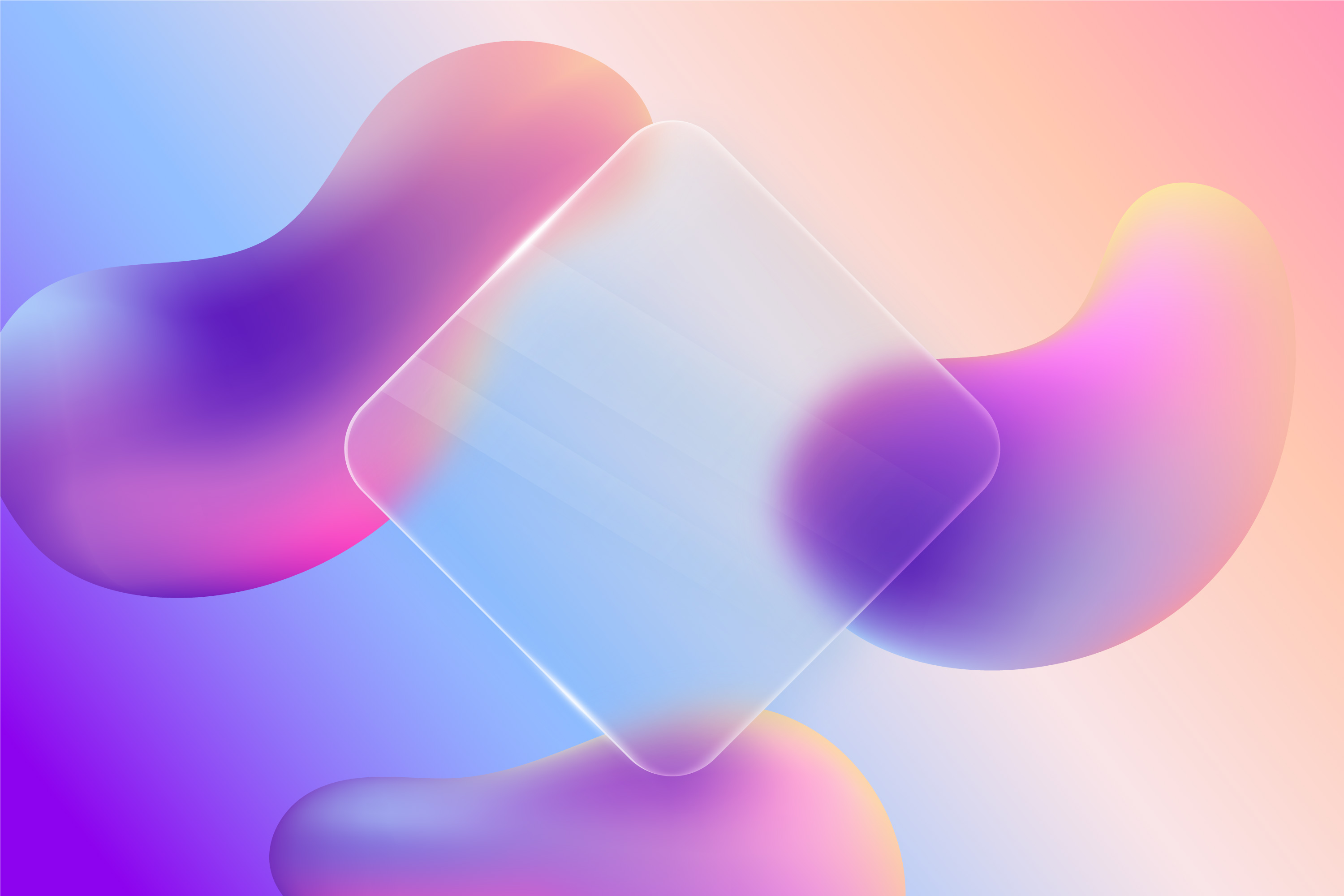
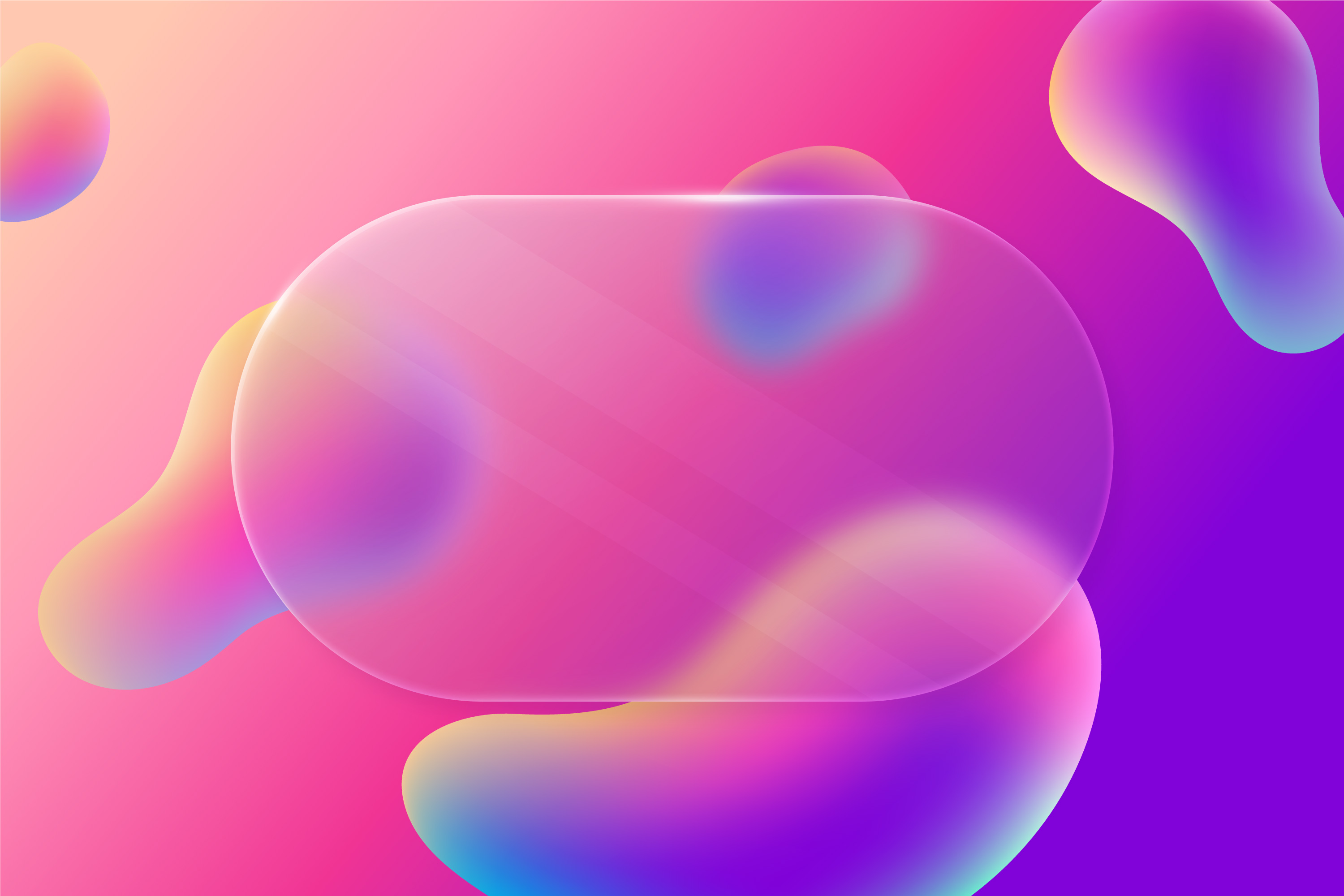
A convincing glass panel is more than a semi-transparent div. Four CSS properties work together to sell the illusion:
Translucency — Use rgba() or hsla() background colors with an alpha between 0.1 and 0.4. Too high and it looks solid; too low and it disappears entirely.
Backdrop Blur — The defining property. backdrop-filter: blur(10px); softens whatever sits behind the element, creating that frosted texture. Without it, you just have a transparent box.
Subtle Border — A 1 px semi-transparent white border (e.g. 1px solid rgba(255, 255, 255, 0.2)) traces the edge of the glass, separating it cleanly from the background.
Layered Shadow — A soft box-shadow lifts the element off the page, reinforcing the illusion of floating glass.
2. The Accessibility Trap — and How to Escape It
The most common glassmorphism mistake is ignoring contrast. Because the background behind your glass panel is colorful, dynamic, or blurred, the text sitting on top can easily wash out — especially for users with low vision.
WCAG 2.1 requires a minimum contrast ratio of 4.5:1 for standard text. In a glassmorphic design, your 'background' is constantly shifting, so you need to compensate:
Darken or lighten the glass: If you're using white text, raise the panel's opacity enough to create a consistently dark backdrop underneath it.
Increase font weight: Thin fonts dissolve on blurred surfaces. Stick to medium or bold weights to keep copy crisp.
Test your contrast: Run your color combinations through a contrast checker — like the DesignCoder Color Contrast Checker — to confirm you're hitting AAA or at minimum AA standards before shipping.
3. Best Practices for Professional Implementation
Don't overuse it. Glassmorphism shines on accent elements — navigation bars, sidebars, modal dialogs, hero cards. Applying it to every element on the page creates visual noise and makes the UI feel unstable.
Use a vibrant background. The frosted effect is invisible on flat grey or white surfaces. It needs shapes, gradients, or high-contrast imagery behind it to register at all. If your background isn't interesting, the glass effect adds nothing.
Watch the performance cost. backdrop-filter: blur() is GPU-intensive and can stutter on low-end mobile devices. Apply it to a handful of key components rather than large page regions, and always test on real hardware.
4. Build Your Glass Effect in Seconds
You don't need to manually tune RGBA values and blur radii by hand. Use the DesignCoder Glassmorphism Generator to visualize the effect live — adjust Blur, Transparency, and Border until the look fits your brand, then copy the production-ready CSS directly into your stylesheet.
Want to keep your UI modern and accessible? Explore more Design Tips.